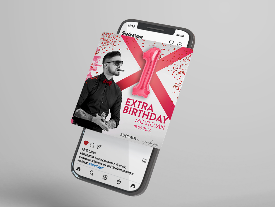
We started by exploring various elements of the regional music scene, including genres, artists, and distinctive styles. Through analyzing trends and audience preferences, we shaped a concept of visual identity that was authentic and appealing to the regional audience.
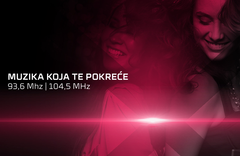
The visual identity included creating a logo and selecting a color palette, typography, and visual elements that reflected the energy and diversity of the regional music scene. We designed the logo to clearly communicate the station’s identity, combining elements that were both modern and recognizable.
How did we do it?
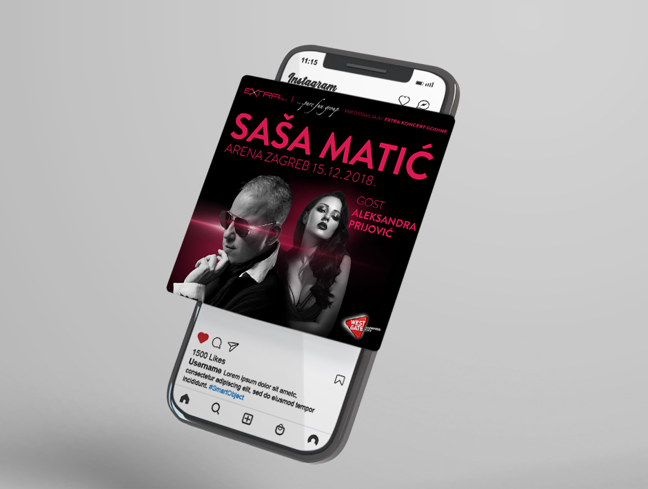
In the process of creating the visual identity, the focus was on crafting an impressive and easily recognizable design that would highlight Extra FM as a relevant destination for fans of regional music. We carefully selected design elements to achieve harmony between a modern look and the authenticity of the region we represent.
Through collaboration with the Extra FM team and adapting the design to their preferences and feedback, we succeeded in creating a visual identity that simultaneously reflects the station’s character and attracts the target audience with its aesthetic and content values.
Year
from 2018

Service
Visual Identity

Customer
Extra FM
View Similar Works


