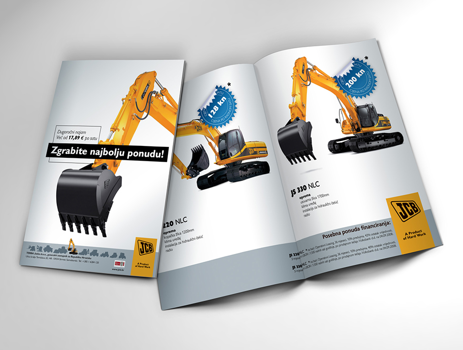
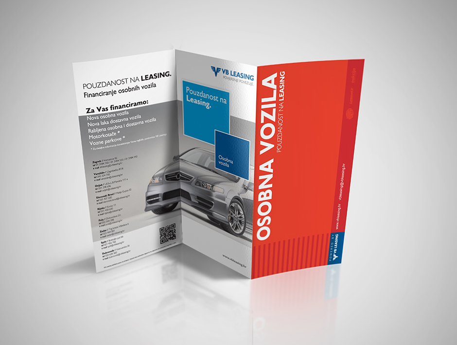
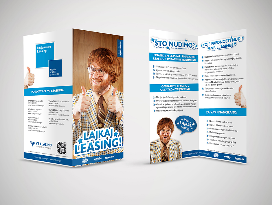
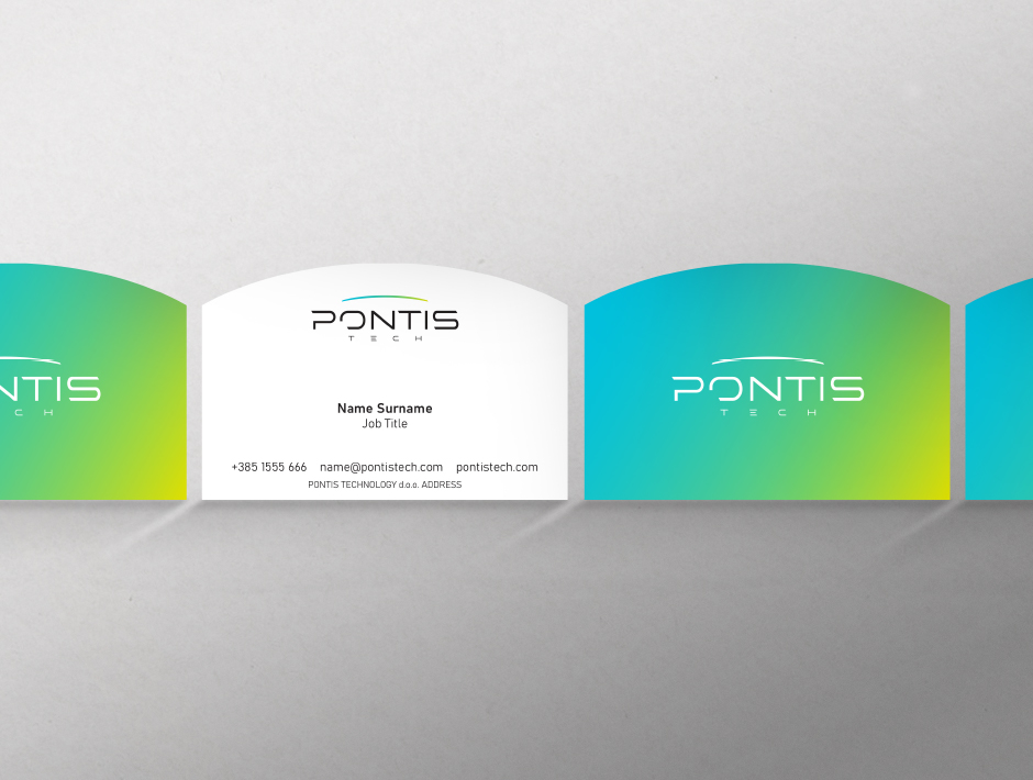
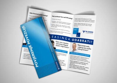
We began by analyzing the Pontis brand, exploring its objectives, target audience, and competition. Based on this knowledge, we shaped a visual identity that was contemporary, dynamic, and recognizable. This included creating a logo, choosing colors, typography, and other visual elements that reflected Pontis’ personality and identity.
When it comes to the website, we focused on user experience and functionality. First, we defined the site’s architecture, identifying key sections and content to be featured. Then, we designed an interface that was intuitive to navigate and aesthetically appealing, using modern techniques and trends in web design.
How did we do it?
Once we received approval for the design, we proceeded to develop the website, using the latest technologies and tools to create a responsive and optimized site. We integrated features such as a contact form, product/service gallery, and options for online purchases or contacting.
Through testing and iterations, we ensured that the Pontis website functioned seamlessly on different devices and browsers and provided users with a pleasant browsing and interaction experience. In this way, we were able to create a strong visual identity and functional website that support the growth and success of the Pontis startup.
Year
2023

Service
Identity & Web

Client
Pontis
View Similar Works


