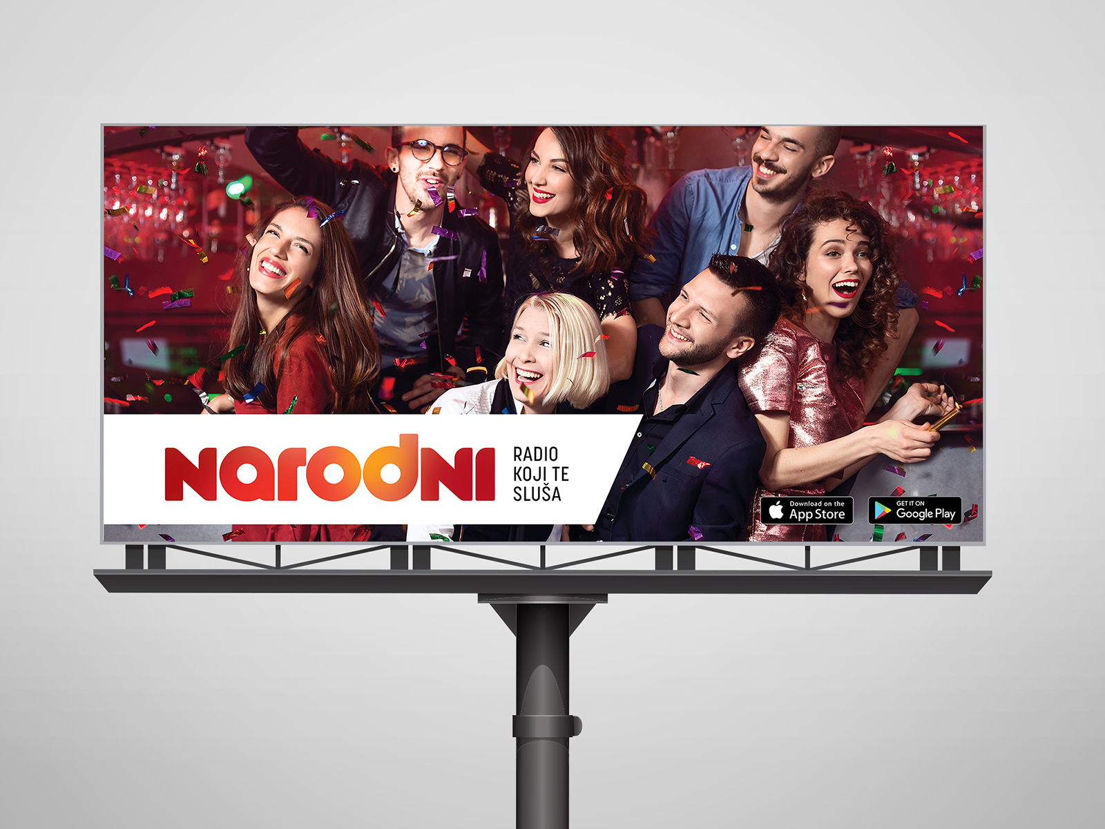
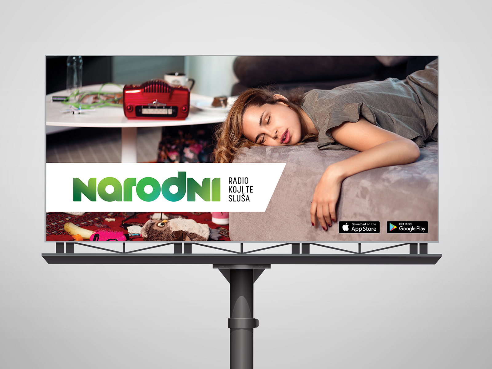
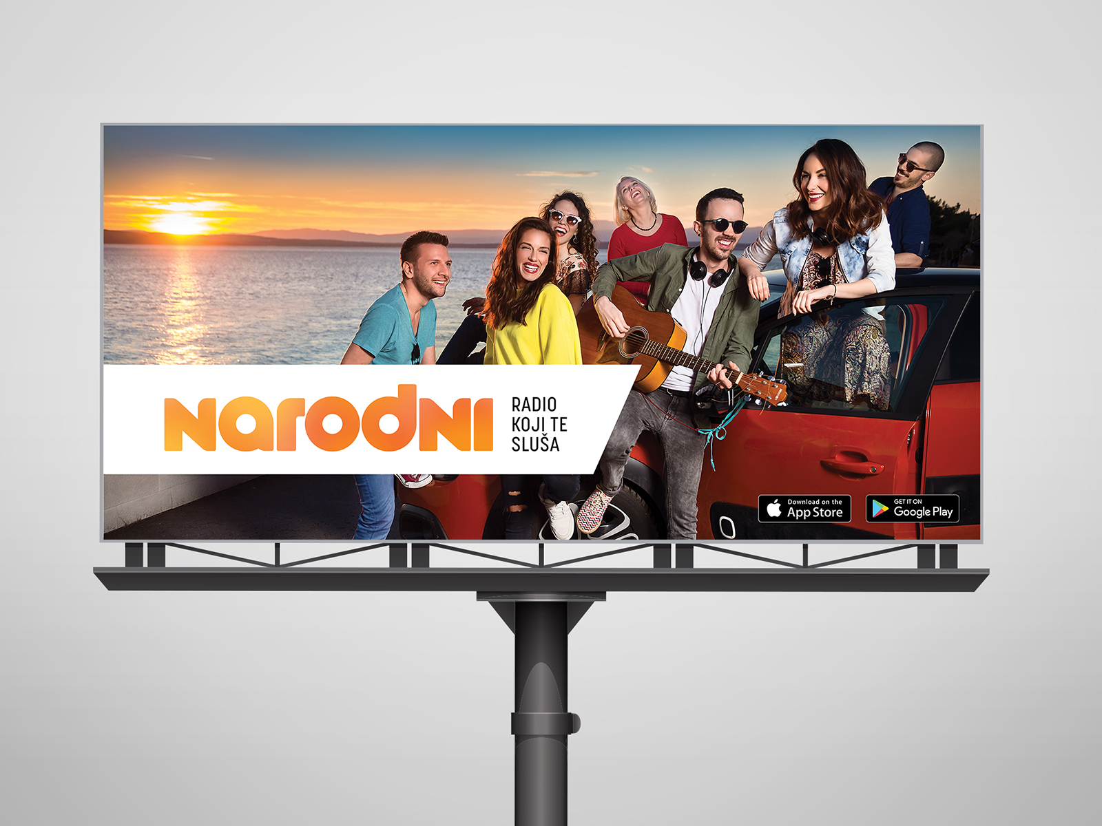
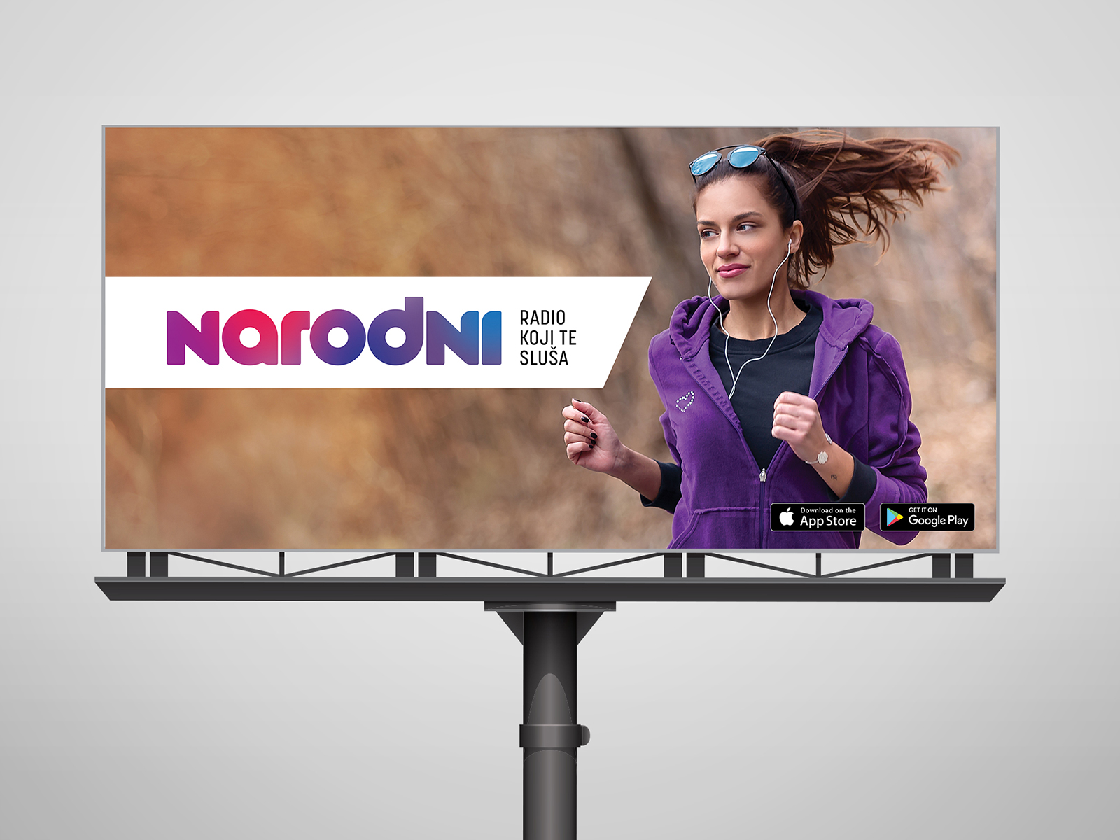
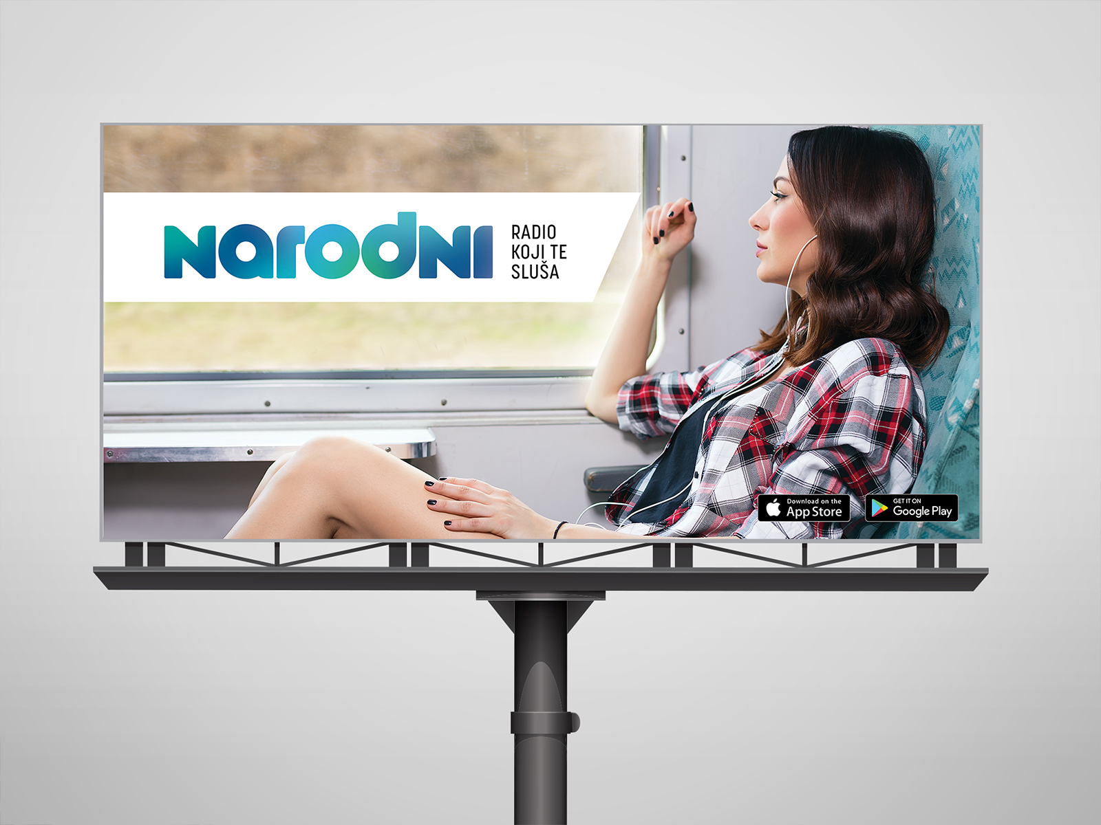
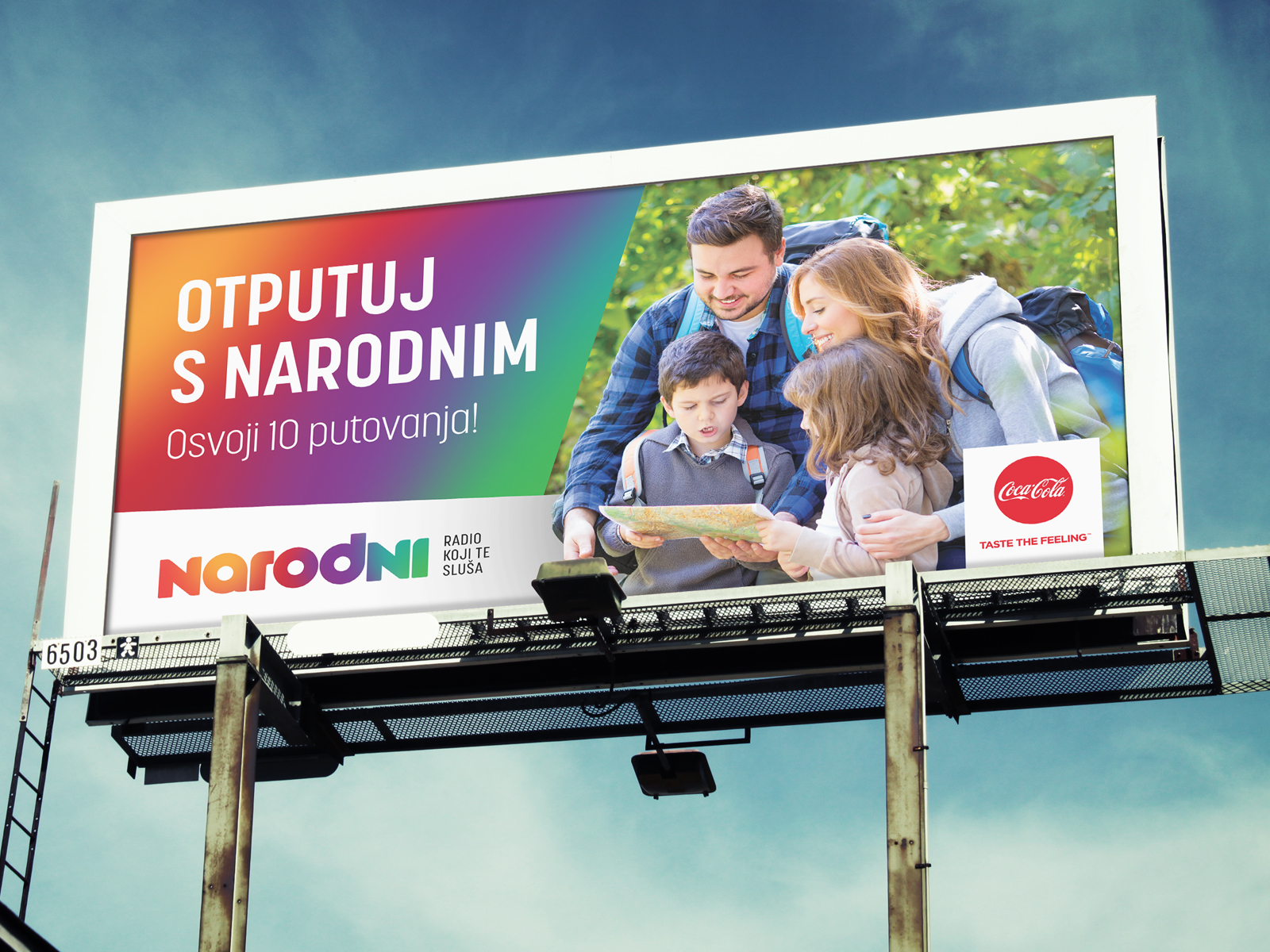
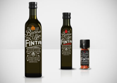
Using the fundamental elements of the brand and the guidelines of the graphic standards, we developed a series of visuals that were consistent with the brand yet appealing to potential customers.
We opted for a clear and recognizable font that aligned with the brand’s tone of communication, integrating key visual elements of the brand in a striking and easily noticeable manner.
Considering the target group, we utilized colors and graphics that captured attention and encouraged action.
How we did it?
To achieve the desired effect, we carefully planned the layout of elements on the billboards, considering readability and aesthetics. Each design was meticulously tested and adjusted to achieve optimal visibility and brand recognition. After finalizing the designs, we collaborated with partners for the production and placement of billboards in strategically important locations, ensuring maximum reach to the target audience.
Year
from 2018

Service
Visual Communications

Client
narodni
More Related Projects


